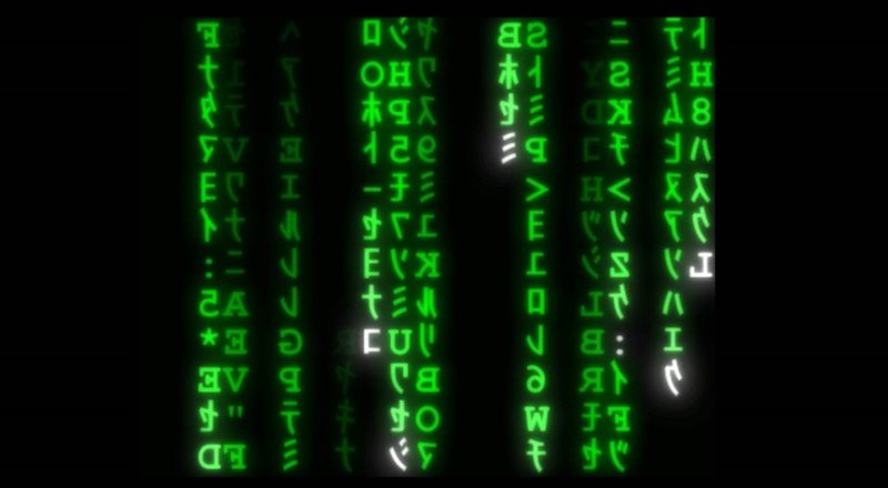
You could say that The Matrix digital rain is the ultimate form of visualisation, as it represents in 2D everything that happens in an entire virtual world inhabited by a race of human batteries.
It’s elegant and sparse, comprising only mirror-image Latin letters and numbers with Japanese half-width katakana, all in green or white and represented with rain animation.
Too bad it isn’t real, the digital rain part, not the part about batteries. Or is it? Hmm…
Open Source Packages
The other end of the visualisation spectrum comprises basic charts and figures, many of which are used in exploratory data analysis. These are readily available in various open source packages like matplotlib, seaborn and plotly.
In addition, they also provide intermediate functionality like adding time animation to time series data. For example, Plotly provides a step-by-step guide on how to write code to animate the classic gapminder dataset. To see it in action, scroll all the way to the bottom of the Plotly page and click “Play”.
For the inspiration behind this animation, here’s the late Hans Rosling in his own words.
More advanced techniques are available in other libraries like D3, which, for example, can render force-directed graphs to depict complicated networks like global trade flows (click on “Show edges” to see the network interconnections). The plan is therefore to figure out what’s available in these packages, and learn when and how to use them effectively.
Commercial Software
In addition to the free tools above, there are many commercially-available (i.e. paid) software that specialise in visualisation. The most famous of which is Tableau, which has annual revenues in excess of USD 1 billion and has more than 86,000 customer accounts across numerous industries.
Various machine learning software will likely have modules that automate data visualisation. For example, IBM Watson Studio has a Data Refinery module that allows you to easily run advanced techniques like t-Stochastic Neighbor Embedding (t-SNE) to visualise high-dimension data.
Visualisation Techniques

I’ll start by reading “The visual display of quantitative information” by Professor Edward Tufte.
The first edition was self-published in 1983 with an interesting backstory that mentions a bank loan to a circus to buy an elephant.
The second 2001 edition (in colour!) is available on Amazon but unfortunately not in Kindle format.
Techniques of visualising and interpreting multi-dimensional data are of particular interest to me, and t-SNE is just one of many that have been developed. Since visualisation is an area that I’d like to build deep expertise in, it definitely requires further study.
Feature image credit: By Jahobr – Own work