Hot off the heels of some geospatial visualisation that I built using global coffee production data in 2020, I wanted to see if I could use all the data available from 1991-2020 to render a bar chart race.
After some googling, I found the bar_chart_race package that allowed me to do exactly that, with surprisingly minimal code.
Installing and Importing Packages
First things first, I added the standard os, np and pandas imports that come with every Kaggle Notebook. Then I tried importing bar_chart_race directly, but it wasn’t recognised, so I had to do a pip install of the package first.

Loading Data
I re-used the same CSV file containing global coffee production that I had uploaded previously to Kaggle Datasets, and called pd.read_csv() with the appropriate character encoding.
It was a small dataset, with country-level data kept in rows and annual coffee production numbers from 1991 to 2020 held in columns.
There was an additional “Type” column that indicated if the coffee was Arabica (A), Robusta (R) or both (A/R, R/A), but this wouldn’t be needed when creating the bar chart race.

Reformatting Data
According to the bar_chart_race PyPI page, the input dataframe required “every row to represent a single period of time”, and “every column to hold values for a particular category” with the “index containing the time component”, although the last part was optional.
Since my input data was the other-way-round, I had to transpose it. But before I did that, I had to drop the un-needed “Type” column first.
I also had to set the “Country” column as the dataframe index, so that it would become the column name after transposition. Some of the country names were a bit too long, so I renamed them.

Generating Bar Chart Race
Once the dataframe was in the right format, calling bcr.bar_chart_race() was quick and easy, though it does take a few minutes for processing to be completed.
There are quite a few parameters available to customise the chart, and more details can be found in the API reference page.
When the filename parameter is set to None, the chart (or rather video) is rendered on screen as a Notebook output. If a filename is provided instead, the video is saved as an .mp4 file that can be downloaded.
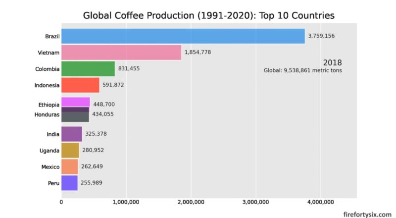
My first attempt used all 55 countries in the dataset, but the bar chart was too long, so I shortened it to just the top 10 using the n_bars parameter. To revert back to using the entire dataset, just comment out this parameter.

Downloading and Converting to .GIF
In addition to rendering it on-screen, I also downloaded the bar chart race as an .mp4 video file, which I then converted into a .gif file using an online video-to-gif converter.
And that’s all it took to generate a bar chart race!

Note: The Kaggle Notebook with complete Python code can be found here, together with the bar chart race. You don’t need a Kaggle account to view the code and run the race, but you will need an account if you want to fork a copy of the code and execute it.