It’s been a year since I traded in my old Nespresso machine for a new Creatista Plus, and I’ve been happily making the occasional flat white as an afternoon pick-me-up.
Our daily caffeine fix comes from black pour over coffee that I brew every morning, so this secondary supply is only activated when I feel particularly sleepy after lunch, and decide not to take a mid-day nap.
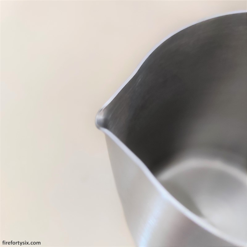
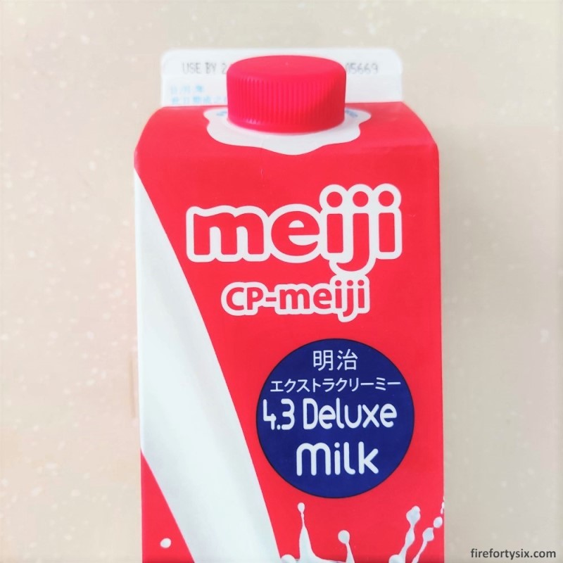
The Creatista Plus conveniently ships with a milk frothing jug, and together with the Meiji “Red” 4.3 Deluxe Milk, I was all set to embark on a latte art journey.
I remember thinking, just before I started, that it can’t possibly be that difficult to pour steamed milk into espresso to make simple shapes. All I’d need was a steady hand and consistent movements, right?
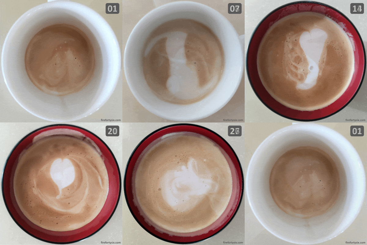
Using the factory-default “Flat White” settings, I made my first two cups of espresso and attempted to free pour a heart 01 and a rosetta 02. As you can see, it didn’t turn out too well. Although you could say that the first cup contained a very vague heart shape. Or maybe not.
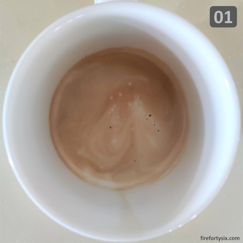
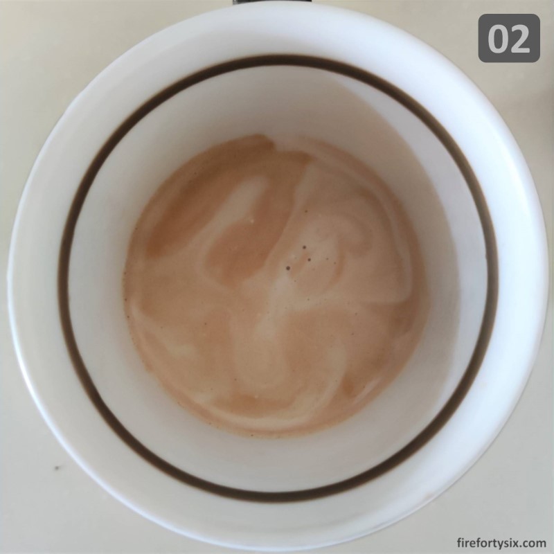
There didn’t seem to have enough foam and the milk wasn’t as hot as we liked, so I upped the “Milk Froth” setting to [3] and the “Milk Temp” to the first level of [Hot] for subsequent attempts.
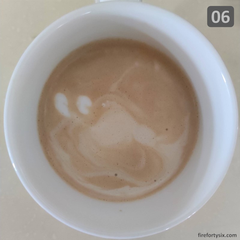
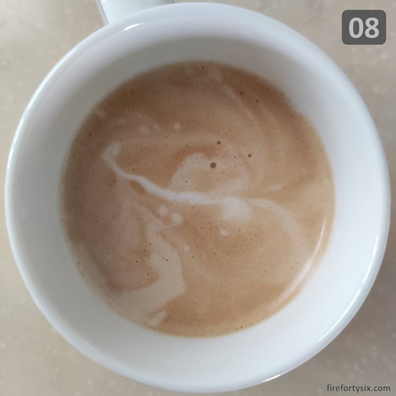
My first ten results oscillated between blobs and swirls, which looked nothing like the hearts or rosettas that I was shooting for. Watching numerous YouTube latte art videos, including those that used the Creatista Plus, also didn’t seem to help much. Though seeing other people succeed did help to keep me motivated.
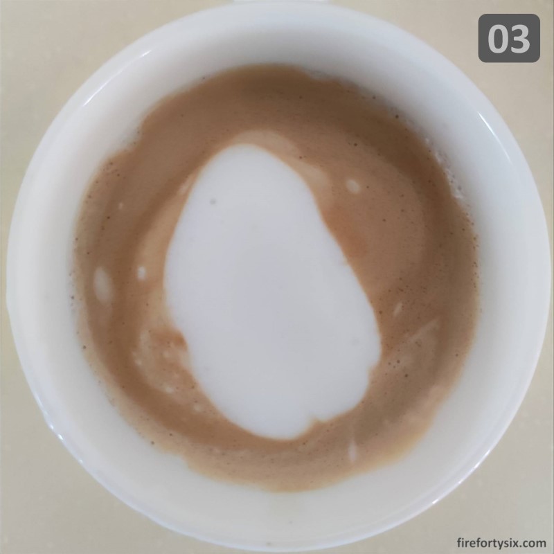
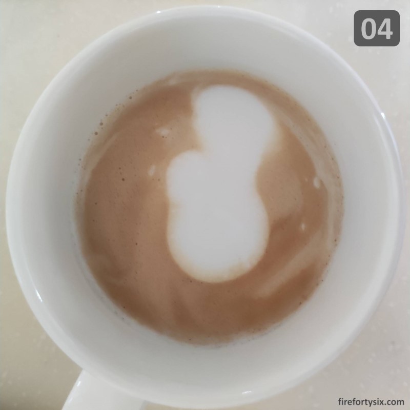
On my 14th try, I finally managed to pour out a body part.
Except that it wasn’t a heart, but a molar. With an extra long root. That was slanted.
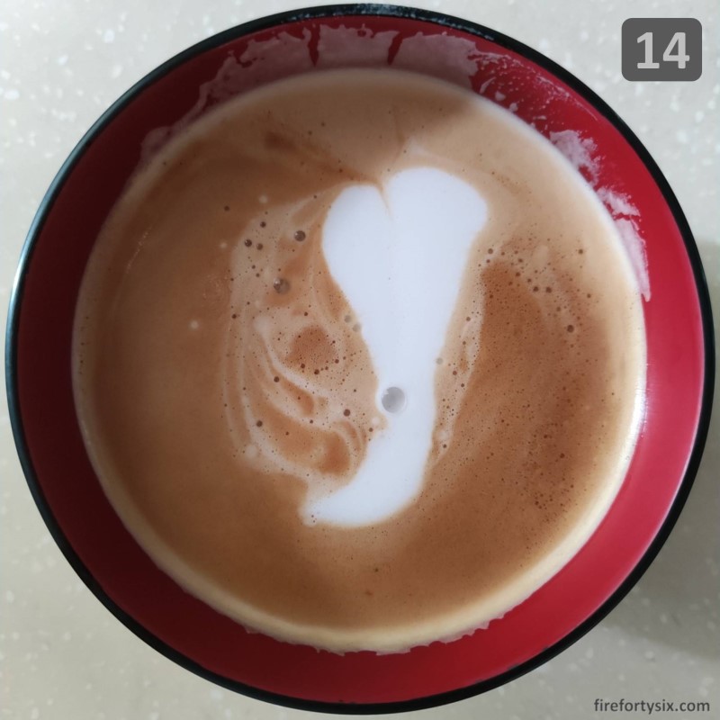
It wasn’t what I wanted, but it was progress. At least that’s what I remember telling myself at the time.
Things started improving over the next few attempts, starting with lucky number 15. I don’t know about you, but it definitely looked like a heart to me. Slightly asymmetrical, but hey, it still counts!

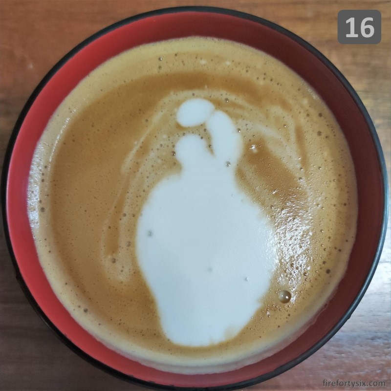
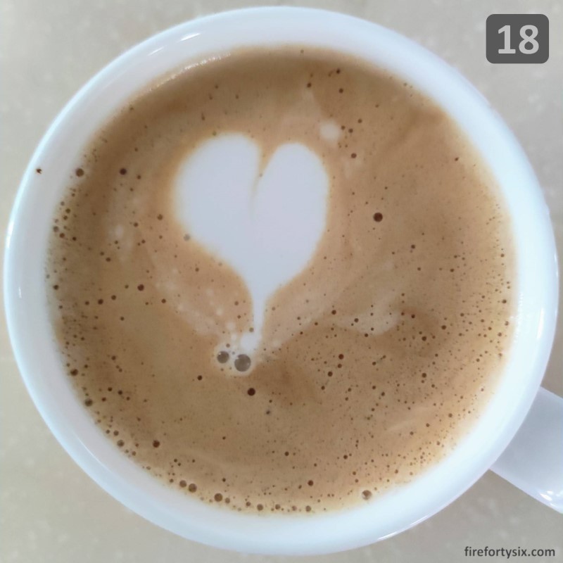
That was followed by an even more significant achievement — 16 an anatomically correct heart. Unfortunately, I have no idea how to recreate it, so it will have to remain a unique piece of art. I did manage to follow it up with a cute version on attempt 18 though.
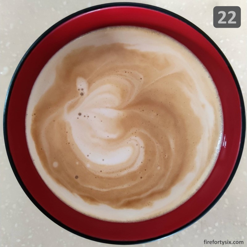
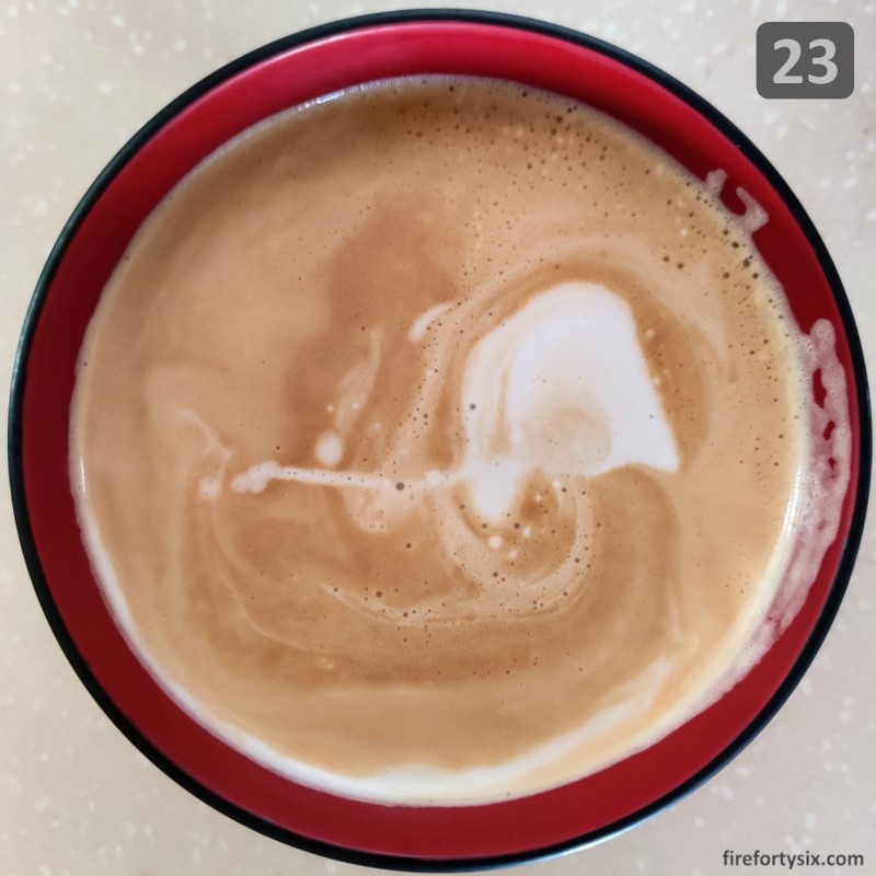
Unfortunately the streak didn’t continue, and I started entering into this abstract art phase which yielded strange, but quite pretty results. Enter exhibit 22 “Onion”, and exhibit 23 “Elephant”.
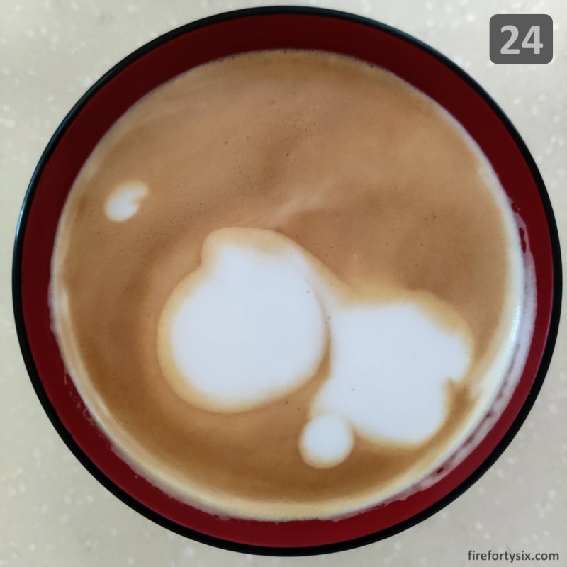
And the one that is my all-time favourite, exhibit 24 “Yoshi”. Fans of Super Mario Brothers will immediately see the uncanny resemblance. Particularly the beautifully round nose.
But if you have no idea what I’m talking about, just google “Mario Brothers Yoshi” and you’ll see what I mean.
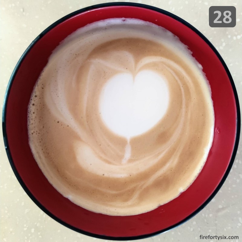
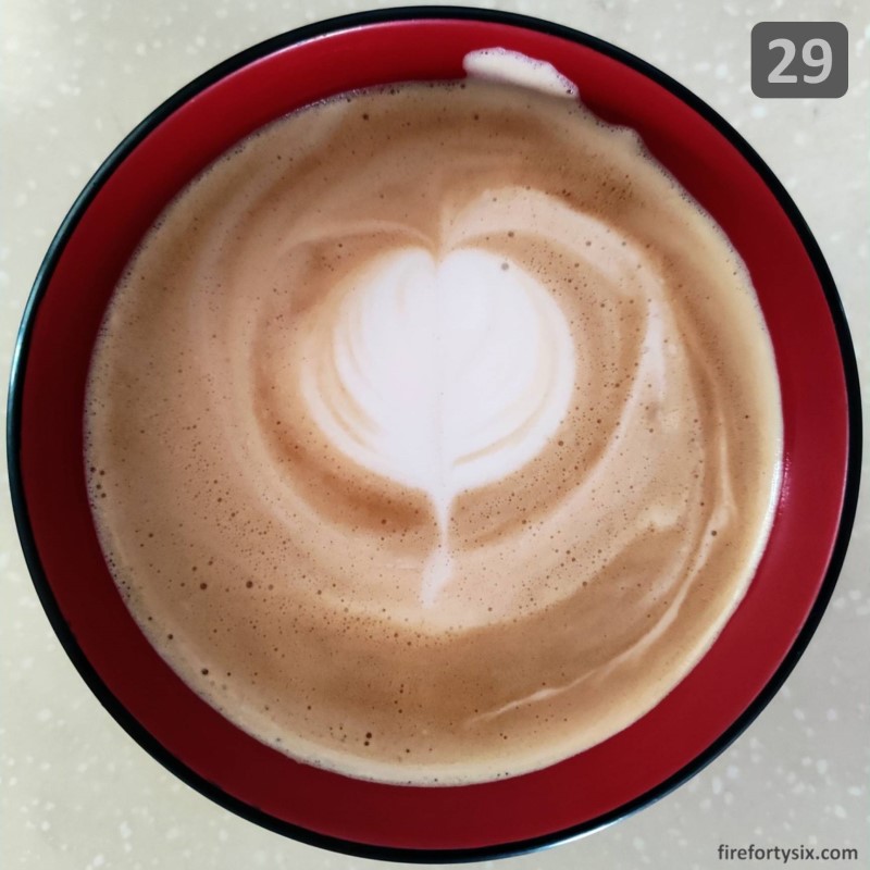
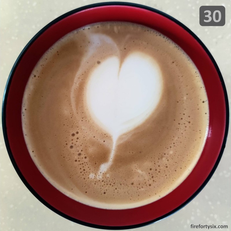
The abstract art phase quickly transitioned into tulip mania, with four back-to-back pours of the iconic flower. Except it wasn’t the typical tulip shape that baristas love and recognise, but highly pathetic stylised interpretations.
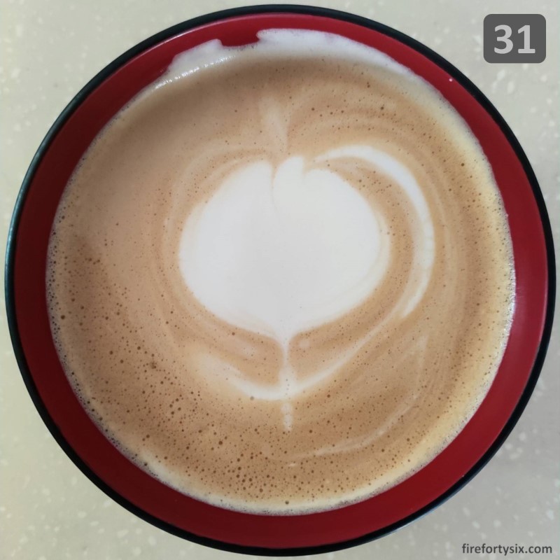
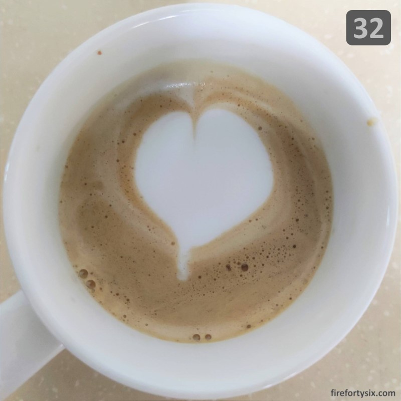
On my 32nd attempt, I finally succeeded.
Sort of.
Yes, it could be more centred. And more defined. With a sharper tip. And separated lobes. That were symmetrical.
But as they say, beauty is in the eye of the beholder, and this looked beautiful to me.
After that, I decided to quit while I was ahead and stop trying to do latte art.
There are things that I’m good at, and things that I’m not so good at. Free pour latte art definitely belongs in the second bucket, and getting this far was already quite an achievement.
I just have to accept the fact that I’ll probably never become a competent barista who can effortlessly pour beautiful milk patterns on cups of espresso. Which is perfectly fine by me.
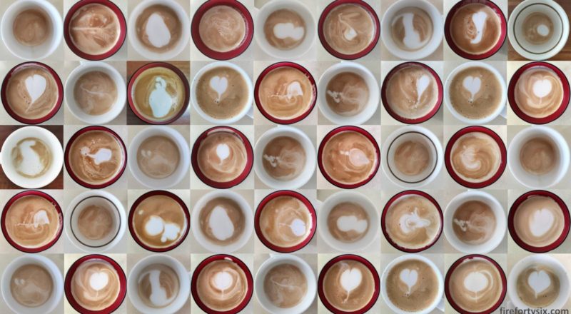
And in the future, if I ever get selective amnesia and believe otherwise, I simply have to watch the animated GIF below of my latte art journey, and remind myself that, sometimes, the truth hurts.
