James Hoffmann is a leading voice in the world of coffee, and here’s his recent review of the DF64 electric grinder. For some reason, at the 10:49 minute mark, he goes on a 25 second rant about the ugly font used in the grind setting dial.
Yes folks, you heard the man, fonts are an important consideration when choosing your coffee equipment.
Unfortunately, the video came out after I had already bought my 1Zpresso JX-Pro manual grinder, but it did make me really curious as to the actual font used in the grind setting dial, so I decided to take a really close look.
Thankfully, the numbers looked nice and didn’t use the outdated Comic Sans-ish font of the DF64 grinder. In fact, they seemed quite elegant and unique.


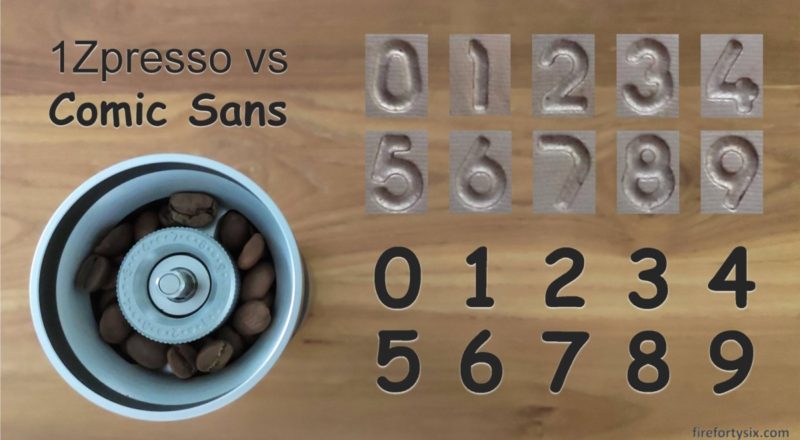
Here are all ten digits, zoomed in and presented side-by-side.

The number “5” looks particularly interesting, with its prominent angles and truncated top line. Unfortunately, it looks quite similar to “6” and regularly confuses me, especially when I’ve not yet consumed my morning dose of caffeine.
The number “7” appears almost boomerang-like and given that the numbers are probably machine-milled, I’d imagine that carving its shape out of the hunk of metal would have been especially efficient.
I proceeded to fire up Microsoft Powerpoint and imported the images of all the 1Zpresso numbers and laid them out, together with their typed out counterparts. And then I methodically compared them against each and every font, using patience and eyeball power.

The good news is that it clearly was not Comic Sans (phew!). The bad news is that after scrolling through all the available fonts in Powerpoint, none of them matched.
Since that didn’t work, I asked my good friend Mr. Google to “find font” and his top two recommendations were WhatTheFont, who boasted “instant font identification powered by the world’s largest collection of fonts”, and FontSquirrel, who was more modest and only asked that I “upload an image with type and we’ll identify the fonts that match”.
Given that the number “5” looked the most unique, I chose it as the reference point. The edges in the photo weren’t clear enough to be detected properly, so I traced the outline and created a black-and-white image. Unfortunately, the candidates that both sites suggested didn’t match either. Strike two.

Well, if the internet doesn’t know, then surely 1Zpresso themselves must have the answer. I went to their official Facebook page and asked them directly.

While I waited for their reply, I decided to try my luck and posted a question on Reddit’s r/pourover to crowdsource an answer. Someone there suggested that I also post it on the r/identifythisfont subreddit, where a kind and knowledgeable font guru u/elzadra1 replied:
“Not a font. Something like this is done mechanically in the machining process. There’s a matrix but it isn’t a font.”
And added some interesting information:
“Industrial numbering is often done in DIN or a style close to it, but this doesn’t look like DIN… [which] comes into the typographical world from a slightly different angle from most fonts. It was meant for technical use but is now being used all over the place because it’s legible and attractive.”
This was consistent with the reply from 1Zpresso a few days later. For those of you who don’t read Traditional Chinese, it says: “Thank you for your support. This font was designed by our company.”

Just for fun, I cut-and-pasted this into Google Translate to check the current state-of-affairs in machine translation. Very close, wouldn’t you say?

So, there you have it, mystery solved.
If you are also an owner of the 1Zpresso JX-Pro and have been curious about the font used for the numbers in the grind setting dial, well, now you know.
Tune in next time, for another exciting episode of “Things that don’t really matter, but I really have to find out”.
